Hello,
I would like to present a step-by-step instruction for students on how to properly format a graph for the needs of a laboratory report (e.g. physics) so that the tutor does not get stuck. The purpose of this guide can be illustrated by the following two graphs:
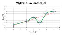
A properly formatted chart:
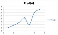
A chart that shows nothing:
How to achieve this effect? Example: Table 1 shows the results of the current measurements as a function of voltage.
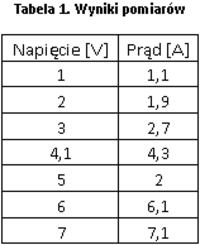
In order to create a graph from the presented data, it is necessary to:
1. Mark the area of Table 1.
2. Go to the "Inserting" section
3. Select one of the types of charts there, which can be found in the "Charts" section

Most Excel manuals and tutorials contain line charts. It is a mistake to use them to solve this problem! A sample line chart is shown below:
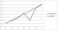
As you can see, the chart presented above DOES NOT reflect the actual relationship between the measurement data. It is worth paying attention to the X axis, on which the values are between some intervals. Avoid line charts in your reports! They are used in other situations, never in the report.
Instead, select the Scatter plot. This example shows a Scatter (XY) plot with markers and smooth lines. In practice, various scatter plots are used, depending on the needs, e.g. when presenting 1000 samples, the markers are turned off so as not to darken the image.
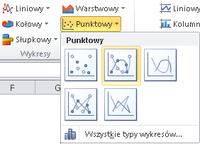
After selecting the mentioned option, Excel will create the following chart:
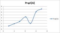
Now the presented dependency is consistent with the table. However, the chart itself still shows nothing. First, the axes of the coordinate system should be marked, along with their sense. To do this, right-click on the axis and select "Format Axis".
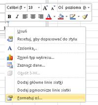
Then, modify the Line color (solid line, black color), and the Line style (End type - arrow).
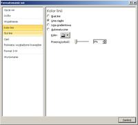
After the changes, the graph should look like this:
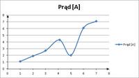
However, it is still unknown what values are presented on the individual axes. To change this, describe each axis. To do this, left-click on the graph to select it. The "Chart Tools" option will appear. There, select "Layout", and from the "Labels" section, select "Axis titles".

Axis titles will appear:
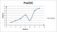
When describing each axis, give the UNIT in which the data are presented. The chart legend is needed when there is more than one curve. In this example, there is only one curve, so the legend has been removed.
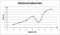
REMEMBER! ALWAYS SPECIFY UNITS! BOTH THE CHARTS AND TABLES, THE RESULTS OF THE CALCULATIONS, ETC. !
Then add grid lines.

When the gridlines appear, you can right-click them and then select "Format Gridlines".
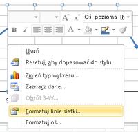
Their color should be changed to gray 25% so that they do not blend in with the chart. Gridlines are useful for reading the value of individual points from a plot. Make sure the grid lines are not too dense. Usually, only the main grid lines are enough, the auxiliary ones are often redundant.
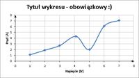
The chart is almost ready. In physics classes, however, error bars are also often required. The value represented by the error bar is equal to the measurement error value for a given point. The official instructions for error bars can be found here: Link
However, it is worth knowing that to add error bars, first select the chart area with the left mouse button, and then select: Layout -> Error bars

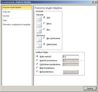
IMPORTANT! Each chart must have a TITLE!
If there are more charts, each chart must have its number
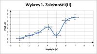
Now, in addition to the graph, a trend line should be added that reflects the ideal course of the function under study. In order to add a trend line, right-click on the data series and then select "add trend line"
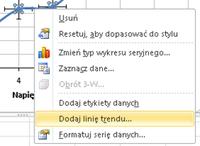
In this example, a linear trendline has been selected because it is assumed that the relationship is linear. Always select a trend line that is compatible with the type of ideal function describing the phenomenon under study.
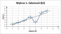
Interpretation:
If the trend line (it can be understood here as the ideal course of the tested function) crosses all the measurement points on the graph, or passes through all the error bars, the measurements have been made correctly (all values are within the measurement error range).
In the given example, the value of 2A, at 5V, differs significantly from the trend line (now you can see what the descriptions next to the axes are for - so that you know what you are talking about). This means that in this place the so-called "gross error" (the measured value differs from the expected value by far more than the value of the measurement error predicted). Such a measurement (point) MUST NOT be taken into account during calculations!
Going the easy way: To avoid the hassle of formatting 20 charts for each report, you only need to create one and then copy it. After copying, right-click on it, and then select "Select data"

Then, select the table with the measurement results and adjust the details of the graph, such as:
Axis min / max values (if set manually),
Error bar values,
Trend line type
Axis descriptions
Chart title
Units
Final remarks:
Before concluding the tutorial, I would like to give you some general guidelines for reporting. This does not exhaust the topic, but allows you to avoid the most common mistakes:
1) Each drawing, table or graph must have its title and number. Figures are numbered separately, charts separately, tables separately (Fig. 1, Fig. 2, Table 1, Table 2, etc ... . In MS Word, after right-clicking on a given element (table / figure), there is an option "insert signature". Thanks to this, Word numbers items automatically, one problem solved ;)
2) In a scientific text (such as a laboratory report), reference should be made to tables / figures with specific numbers. You should write "blah blah blah as shown in fig. 1" INSTEAD OF "blah blah blah as shown in the figure below"
3) A scientific text is always written in an impersonal form, eg "measured, presented, presented". Personal phrases such as "measured, presented, presented" are never used.
4) Absolutely ALWAYS indicate the units in which measurements or calculations were made. A result without an individual is meaningless. In my calculations I got the result 10. And you guess if it is 10mV, 10V, 10kV, 10A, 10mA, or something ...
5) If the unit does not result directly (from something), then a UNIT ACCOUNT should be made, in which the path obtained, e.g. N / ma not A / m, should be given.
6) The so-called the calculus of errors is a wider topic, for a separate guide, but nevertheless it is also an important element of the work.
7) Every report (whether it is a report on physics, chemistry, biology, computer science, botany or anything else) MUST INCLUDE A CONCLUSION! Conclusions are often the most important in the entire work. When creating them, you should consider such issues as:
a) What was the goal? (what I wanted to achieve?) -> Then, when writing conclusions, focus on the goal.
b) What has been achieved? Why? How?
c) What follows from this? Why?
d) Have I discovered something? Why? How?
e) Does the applied method influence the obtained results? How?
f) What was observed? On what basis?
g) If the purpose was to determine if the device was working, state whether it works or not and justify your answer.
h) The equipment does not work - first report it to the teacher. If a failure actually makes it impossible to perform a given exercise, make an appointment with him what to do with it. If this is just a minor glitch that blocks the possibility of only one point being made, then it is only worth mentioning in your work. Just to remind the tutor about it when he checks the papers. After all, it's also just a man and he could forget.
i) Remember: we also write applications in an impersonal form!
8) The report should avoid wording such as:
a) There was not enough time (this is just your problem - many students did this exercise before you and they had no problems, there is enough time if you are properly prepared)
b) I was not prepared, I did not know how to run something, I did not know how something works - that's what instructions, scripts, and a facilitator are for. No preparation = sucks
c) The group was busy *** but unfortunately the results did not come out -> measurements or calculations were made incorrectly, this is your problem. Think about why this happened.
d) Classes started too late -> don't play with fire ;)
Greetings,
Sołtys (skim) :D
PS
The entire guide can be downloaded as pdf. If you notice any deficiencies or mistakes, I am open to comments
I would like to present a step-by-step instruction for students on how to properly format a graph for the needs of a laboratory report (e.g. physics) so that the tutor does not get stuck.
A properly formatted chart:

A chart that shows nothing:

How to achieve this effect? Example: Table 1 shows the results of the current measurements as a function of voltage.

In order to create a graph from the presented data, it is necessary to:
1. Mark the area of Table 1.
2. Go to the "Inserting" section
3. Select one of the types of charts there, which can be found in the "Charts" section

Most Excel manuals and tutorials contain line charts. It is a mistake to use them to solve this problem! A sample line chart is shown below:

As you can see, the chart presented above DOES NOT reflect the actual relationship between the measurement data. It is worth paying attention to the X axis, on which the values are between some intervals. Avoid line charts in your reports! They are used in other situations, never in the report.
Instead, select the Scatter plot. This example shows a Scatter (XY) plot with markers and smooth lines. In practice, various scatter plots are used, depending on the needs, e.g. when presenting 1000 samples, the markers are turned off so as not to darken the image.

After selecting the mentioned option, Excel will create the following chart:

Now the presented dependency is consistent with the table. However, the chart itself still shows nothing. First, the axes of the coordinate system should be marked, along with their sense. To do this, right-click on the axis and select "Format Axis".

Then, modify the Line color (solid line, black color), and the Line style (End type - arrow).

After the changes, the graph should look like this:

However, it is still unknown what values are presented on the individual axes. To change this, describe each axis. To do this, left-click on the graph to select it. The "Chart Tools" option will appear. There, select "Layout", and from the "Labels" section, select "Axis titles".

Axis titles will appear:

When describing each axis, give the UNIT in which the data are presented. The chart legend is needed when there is more than one curve. In this example, there is only one curve, so the legend has been removed.

REMEMBER! ALWAYS SPECIFY UNITS! BOTH THE CHARTS AND TABLES, THE RESULTS OF THE CALCULATIONS, ETC. !
Then add grid lines.

When the gridlines appear, you can right-click them and then select "Format Gridlines".

Their color should be changed to gray 25% so that they do not blend in with the chart. Gridlines are useful for reading the value of individual points from a plot. Make sure the grid lines are not too dense. Usually, only the main grid lines are enough, the auxiliary ones are often redundant.

The chart is almost ready. In physics classes, however, error bars are also often required. The value represented by the error bar is equal to the measurement error value for a given point. The official instructions for error bars can be found here: Link
However, it is worth knowing that to add error bars, first select the chart area with the left mouse button, and then select: Layout -> Error bars


IMPORTANT! Each chart must have a TITLE!
If there are more charts, each chart must have its number

Now, in addition to the graph, a trend line should be added that reflects the ideal course of the function under study. In order to add a trend line, right-click on the data series and then select "add trend line"

In this example, a linear trendline has been selected because it is assumed that the relationship is linear. Always select a trend line that is compatible with the type of ideal function describing the phenomenon under study.

Interpretation:
If the trend line (it can be understood here as the ideal course of the tested function) crosses all the measurement points on the graph, or passes through all the error bars, the measurements have been made correctly (all values are within the measurement error range).
In the given example, the value of 2A, at 5V, differs significantly from the trend line (now you can see what the descriptions next to the axes are for - so that you know what you are talking about). This means that in this place the so-called "gross error" (the measured value differs from the expected value by far more than the value of the measurement error predicted). Such a measurement (point) MUST NOT be taken into account during calculations!
Going the easy way: To avoid the hassle of formatting 20 charts for each report, you only need to create one and then copy it. After copying, right-click on it, and then select "Select data"

Then, select the table with the measurement results and adjust the details of the graph, such as:
Axis min / max values (if set manually),
Error bar values,
Trend line type
Axis descriptions
Chart title
Units
Final remarks:
Before concluding the tutorial, I would like to give you some general guidelines for reporting. This does not exhaust the topic, but allows you to avoid the most common mistakes:
1) Each drawing, table or graph must have its title and number. Figures are numbered separately, charts separately, tables separately (Fig. 1, Fig. 2, Table 1, Table 2, etc ...
2) In a scientific text (such as a laboratory report), reference should be made to tables / figures with specific numbers. You should write "blah blah blah as shown in fig. 1" INSTEAD OF "blah blah blah as shown in the figure below"
3) A scientific text is always written in an impersonal form, eg "measured, presented, presented". Personal phrases such as "measured, presented, presented" are never used.
4) Absolutely ALWAYS indicate the units in which measurements or calculations were made. A result without an individual is meaningless. In my calculations I got the result 10. And you guess if it is 10mV, 10V, 10kV, 10A, 10mA, or something ...
5) If the unit does not result directly (from something), then a UNIT ACCOUNT should be made, in which the path obtained, e.g. N / ma not A / m, should be given.
6) The so-called the calculus of errors is a wider topic, for a separate guide, but nevertheless it is also an important element of the work.
7) Every report (whether it is a report on physics, chemistry, biology, computer science, botany or anything else) MUST INCLUDE A CONCLUSION! Conclusions are often the most important in the entire work. When creating them, you should consider such issues as:
a) What was the goal? (what I wanted to achieve?) -> Then, when writing conclusions, focus on the goal.
b) What has been achieved? Why? How?
c) What follows from this? Why?
d) Have I discovered something? Why? How?
e) Does the applied method influence the obtained results? How?
f) What was observed? On what basis?
g) If the purpose was to determine if the device was working, state whether it works or not and justify your answer.
h) The equipment does not work - first report it to the teacher. If a failure actually makes it impossible to perform a given exercise, make an appointment with him what to do with it. If this is just a minor glitch that blocks the possibility of only one point being made, then it is only worth mentioning in your work. Just to remind the tutor about it when he checks the papers. After all, it's also just a man and he could forget.
i) Remember: we also write applications in an impersonal form!
8) The report should avoid wording such as:
a) There was not enough time (this is just your problem - many students did this exercise before you and they had no problems, there is enough time if you are properly prepared)
b) I was not prepared, I did not know how to run something, I did not know how something works - that's what instructions, scripts, and a facilitator are for. No preparation = sucks
c) The group was busy *** but unfortunately the results did not come out -> measurements or calculations were made incorrectly, this is your problem. Think about why this happened.
d) Classes started too late -> don't play with fire ;)
Greetings,
Sołtys (skim) :D
PS
The entire guide can be downloaded as pdf. If you notice any deficiencies or mistakes, I am open to comments


